Call for Entry for the
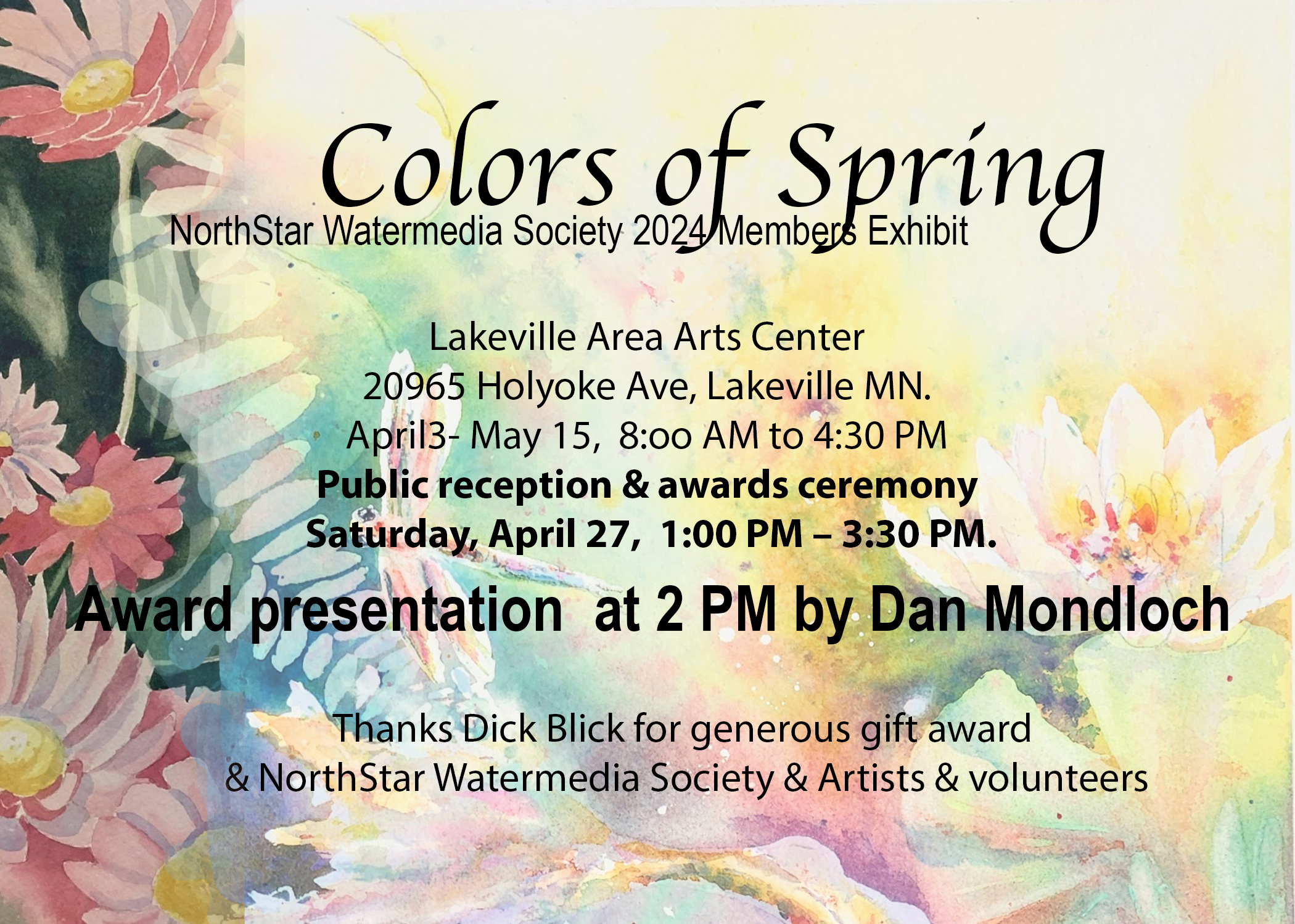
NorthStar Watermedia Member Show:
Colors of Spring

Lakeville Area Arts Center, 20965 Holyoke Ave., Lakeville MN  55044

Entry is limited to NSWS members, up to two paintings. All experience levels are welcome!

 More details when you register at: https://northstarwatermedia.wufoo.com/forms/m1hzbx3w1axct2y/

Want to become a member? Please visit our JOIN PAGE.

Important Dates:

Exhibition Dates:        April 3- May 15, 2024
Registration by:          11:59 pm, March 18, 2024
Painting drop off:       Tuesday, April 2, 10:00 a.m.- 1:00 p.m. Label  with name, title, price on back
Painting Pick Up:        Thursday, May 16, 11:30 a.m.- 3:30 p.m.
Reception and Awards:    Saturday, April 27, 1:00- 3:30 p.m.

We look forward to seeing your new creations!


2023 9th Annual National Juried Exhibition Awards

October, 2023

Phipps Center For The Arts, Hudson Wisconsin

SLIDE SHOW OF ALL ACCEPTED ENTRIES


2023 Exhibition Judge Dan Mackerman

Dan Mackerman has been a fixture in the Twin Cities art scene for over three decades. Highlights of his career include projects with the following institutions: The Smithsonian Institution’s National Building Museum, The Phipps Center for the Arts, Disney, Animal Planet Television, Paisley Park Studio (Prince), Mayo Clinic, and Children’s Minnesota. Of particular note was his work with Dayton’s/Macy’s where he assisted in the design of 25 large-scale narrative installations (13,000 square feet), was lead sculptor, and directed the creation of approximately 1,100 sculptures over a 19-year period. He collaborated with such notables as author Tomie dePaola, Liccy Dahl (for whom he designed sculptures that are permanently on display at the Roald Dahl Museum in Buckinghamshire, England), and Jim Martin and Tim Lagasse. Dan’s work with Dayton’s is featured prominently in two books: Dayton’s: A Twin Cities Institution and Thank You for Shopping: The Golden Age of Minnesota Department Stores, both authored by Kristal Leebrick and funded by the Minnesota Historical Society.

He has work in 72 public collections and has also been featured in a number of media outlets including Fine Art Connoisseur, Plein Air, Town Life, and Midwest Home magazines, the Star Tribune, the Pioneer Press, KARE 11, and 107.1 FM’s “Ian and Margery” show. He has received grants and awards in juried competitions through the years, most recently a 2019 Artist Initiative Grant and a 2021 Creative Support for Individuals Grant, both from the Minnesota State Arts Board.

Dan has been offering instruction in his studio for over 14 years. He teaches both painting and drawing. He holds an MFA from the University of Minnesota and his teaching experience includes work with the following institutions: Peninsula School of Art, the University of Minnesota, Minneapolis College of Art and Design, Luleå University of Technology (Sweden), the Minneapolis Institute of Art, White Bear Center for the Arts, Minnetonka Center for the Arts, Edina Art Center and the Minnesota Museum of American Art.

TO SEE A VIRTUAL SLIDE SHOW OF THE ENTIRE EXHIBIT go HERE

CLICK ON EACH IMAGE TO GET THE LARGEST VIEW ALLOWED ON YOUR SCREEN

2023 Exhibition Judge Dan Mackerman Comments:

Juror’s Note: It’s rare to find paintings that score high in all categories. In several cases I chose paintings because of how well they excelled in only one or two particular categories.

TRIBUTE AWARD 2023 – CAROLE ANDERSON

Z. Feng“In the Wood”
This would compositionally be dull piece without the background.  The tree shapes and hair of the subject mesh together and in some places are indistinguishable, as on the top of the head. This accomplishes two things. First, movement. The background in the lower right and upper left are similar enough with the beard to pull the eye diagonally across the painting, balanced the other direction by lights in front of the face, on his head and the shoulder area. Second, a metaphor. Meshing the background with the subject’s hair creates the sense that subject and environment are part of the same thing. A biomorphic oneness. Even the face has a bark-like appearance.


CHARTPAK AWARD

Karen Knutson – “Country Charm”
This is a very complex composition with lots of moving parts. Almost too many moving parts. But what saves the day is the gradual intensification of color and values that culminate upper right of center. There you find the whitest white, bluest blue and blackest black. As a subtext to the organic shapes are straight, vertical lines, sometimes cutting through the entire painting, very reminiscent of Lyonel Feininger.


JUDITH BEHNAM ART AWARD

Gina Judy – “Where I Grew Up in Steubenville”

A painting can have a great many things that vary but there always has to be something that holds it together. In this case it is a particular shape: the triangle. One might find more, but at first glance I counted 14 just in the house alone. Add to that, the peak of the roof goes off the picture plane and cuts the sky into two shapes. What kind of shapes? You guessed it. Triangles. Also, this is one of those cases, btw, where the black/white mat and frame combo works well because there are whites and darks in the painting that hold their own against the frame. 


DILLMAN’S CREATIVE ART WORKSHOP AWARD

Rick Lundsten – “Steady As She Goes”

This piece caught my eye for a couple of reasons. It’s an interestingly stylized piece. All parts of this image are rendered in one consistent voice. Not as easy as it may appear. And there’s a playful quality about the stylization in everything from the water to the lightening. (In fact, the water is reminiscent of Hokusai’s “Great Wave”.) All this adds to the adventure portrayed in the painting.


ARTISTS’ CHOICE AWARD

Lisa Fertig – “Motion Through the Line”

Just as the title suggests, this is a very dynamic composition. There is nothing vertical, horizontal or straight. Serpentine best describes the brushwork, and it pulls the eye all over the paper. What makes this predominantly Naples yellow and mauve arrangement are the well-chosen accents of mint green and white that give it a spark. There’s a lot to look at. Beautiful, dynamic composition, nice brushwork and use of color.


WET PAINT AWARD I

LYNETTE BEEBE – “Song for a Sleeping Cat”

At first glance what looks to be a childish collage is loaded with sophisticated uses of layered color and texture. It’s basically a game of the blues vs. the warms in which the dominant color blue sets off all the various reds, yellows, oranges and violets. The warms that float throughout the piece vary greatly in intensity and tie together the larger areas of color. Add to this are the primitively rendered characters that stylistically support this playful subject.


WET PAINT AWARD II

Melissa Van Egdom “Warm Autumn Pastures”

One of the things that makes this piece noteworthy is the paper. Its subtle texture and surface quality adds much to the detail throughout this painting. The elements to this painting are very few in number. Almost a visual haiku. The two black cattle are very static looking. But it’s what surrounds them that makes this an interesting composition. The cream to the right, the hard edge where it meets the largest cow, crescendos. The orange in the bottom left corner helps to pull the eye diagonally. Add to this the vibrating blue at the top.


PETER HOPPER AWARD FOR EXCELLENCE

David Smith “Plein Air, Waves and Clouds at Alki, 3-4pm, Windy, 2.7.23”

After the rawness of this piece with the clash between the black waves and white reflection pull you in, you are rewarded with subtleties like the distant shoreline and the soft sky. Having been a professional backdrop painter, I can especially appreciate this artist’s use of simple yet very descriptive brushwork. This is also one of those cases when scale really does make a difference.


THIRD PLACE

John James “Feeling The Blues”

This is a piece that is both simple and complicated at the same time. Contrary to the title, the most eye-catching elements are the two hot red shapes, one set off by black and the other set off by the yellows and a tiny slice of white. That’s the simple part. The complicated part is his use of all the subdued colors that buttress and echo the hot ones. Note the grayish magenta scattered throughout that pick up hot red or the various shades of gray-blue echo the cobalt. The added touch is the texture, used judiciously throughout the composition.


SECOND PLACE

Jeanette Richards “Quiet Conversation”

This is another strong piece that can be seen from any distance. The eye moves clockwise through the blue then is pulled upwards by the vase to a crescendo of whites and yellows. Added to this is the impasto giving this piece a tactile quality. The scattered, fragmented colors pull you through the painting like stones across a stream.


BEST OF SHOW

Christopher Palbicki “Axis Mundi (One Ocean)”

This is both a very strong piece as viewed from a distance and up close when you discover all the detail. It’s a very inventive design and composed well within this unusual canvas shape. And to top it off, the subject is a compelling one…the scourge of plastic, one of the great challenges of our time successfully communicated visually. Even the color is managed in a very harmonious way.


THANKS TO OUR MAJOR SPONSORS: