
2018 NorthStar 4th National Watermedia Juried Exhibition
 Juror Rachel Daly Comments I’d like to thank the Northstar Watermedia Society for giving me the honor of being this year’s juror of your Annual National Juried Exhibition.
I’d especially like to thank Susan Fryer Voigt for extending the invitation, Jill Jacobsen for coordinating the online judging process and holding my virtual hand as I struggled to bring the number of artwork down to the maximum amount allowed, and Janice LaRae Anderson who so patiently and graciously assisted me last week as I selected the awards in person.
I’d also like to thank The White Bear Lake Center for the Arts and specifically Danielle Cezanne for hosting and providing such a beautiful venue for this exhibition. 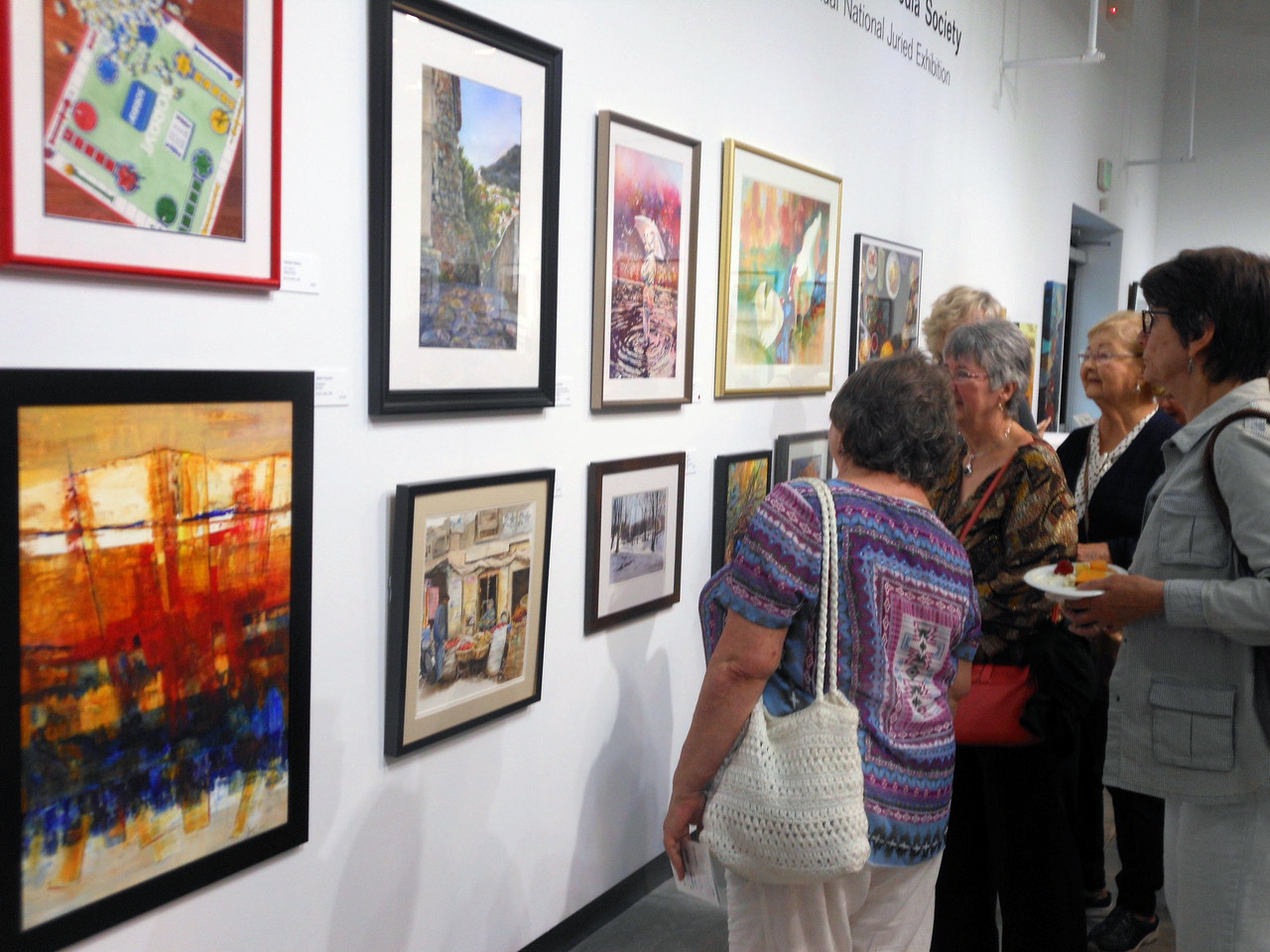 Having coordinated many online reviews and hosting nearly 20 annual members exhibitions over the years, I understand all too well the details and moving parts that need to come together in order to make a show like this possible.
It has been quite impressive to witness the NorthStar process in action and I’m proud to be a small part of it. Thank you! 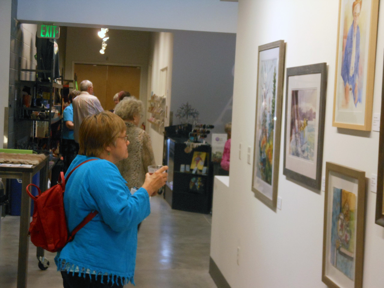
While I was judging the show last week there were a couple adult students in the hall looking at the work and commenting on it. One of them noticed me with my notebook and post-it notes and asked if I was one of the artists. I said No, I was judging. As soon as I said it…I wished I hadn’t. I didn’t know if they were participating artists and realized that was a can of worms I shouldn’t have opened. His follow up question was, “how do you judge artwork?” Having already said too much I gave him a kind of none-answer and went on my way. But what I was thinking and what I really wanted to say was, “You already know how to judge artwork… because you’re doing it right now.”
In fact, most of you have had an opportunity to look at the artwork; you’ve oohed and awed at those you like and scratched your heads at the ones you’re wondering how I let in. You notice the same things I do (technical excellence, masterful detail, use of color, line and light, interesting composition or subject matter, etc.).
Sure, I’d like to think that my education and experience provide me with a bit of knowledge that helps me evaluate artwork. But the secret is… there is no secret. We judge art and many other things, all the time! It’s what we mere mortals are good at and we do naturally. It’s fun but it’s also very daunting. Especially when you have to stand in front of the creators, all anticipating your opinion and…crossing their fingers! So, now that I’ve completely dispelled any credibility I might have had 5 minutes ago.
Let’s talk art:  What was I looking for when I juried in your work? Certainly, the things I’ve already listed: Technical excellence; mastery of detail; command of the elements of design (texture, color, value, shape, line); a successful composition; a unique and interesting perspective and, hopefully, a story to tell. That last one may be my Achilles Heel; I will almost always fall for the image that has something to say over the image that is purely beautiful. That may be a flaw and an introduction of my bias but…there it is.
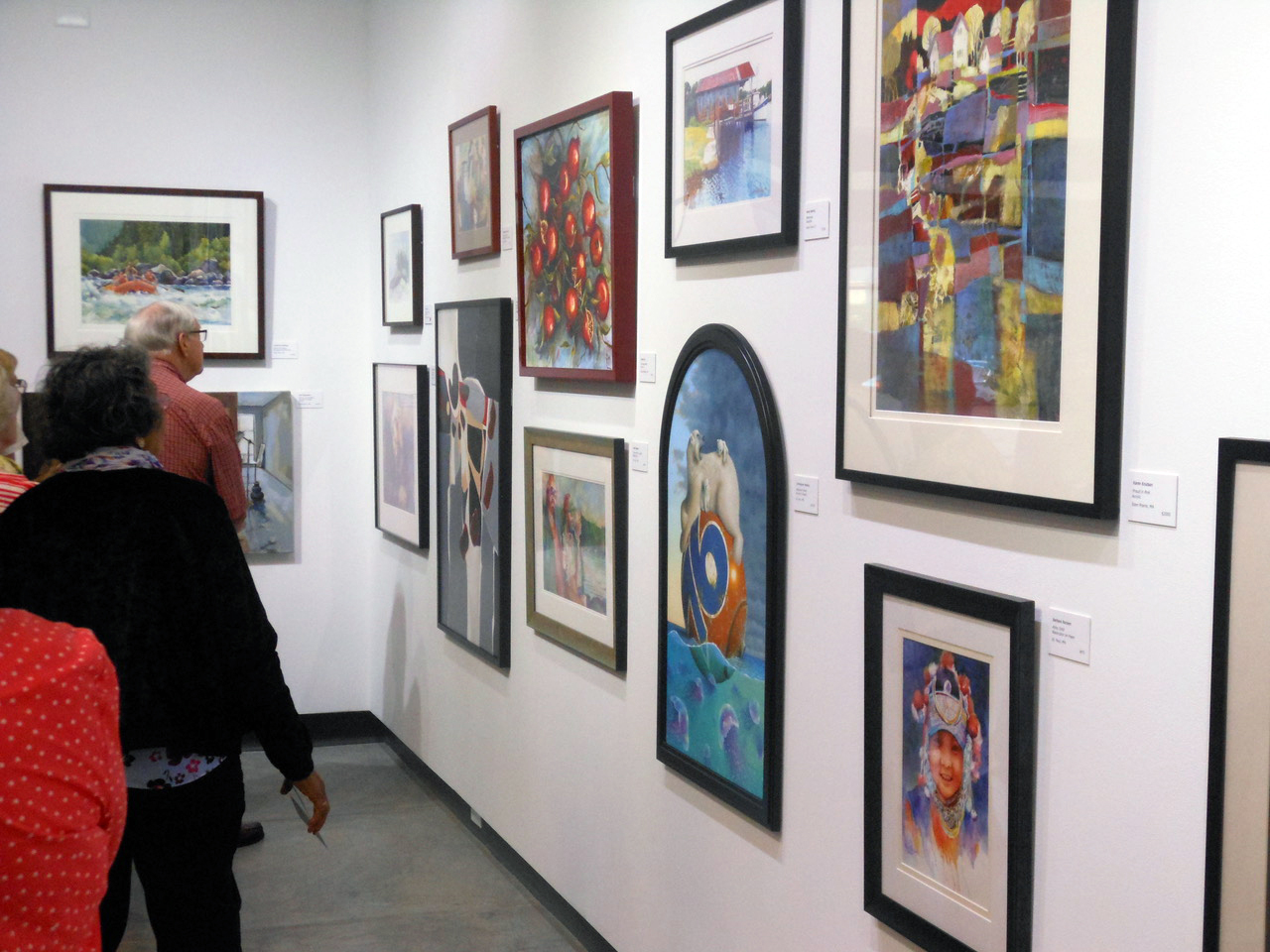
What did I find when jurying in your work? I saw and appreciated the range that watermedia can be. I saw and selected images that were at times vivid, subtle, implied, bold, fluid, tight, spontaneous and controlled. I saw watercolor painted like acrylics and acrylics painted like watercolor. I saw explosions of color and the exploration of a single color. I experienced moods, emotion, action, movement and vitality, as well as quiet stillness and contemplation. Were there distractions?
Sure. When jurying online it is, by and large, a process of elimination. There were way more pieces than I was allowed to accept. So, at first, I’m looking for reasons to say no as much as I’m looking for reasons to say yes. Some distractions that often lend to easy no’s: watermarks, signatures that are too bold and therefore too distracting, poor photo quality (too dark, blurry, or not cropped properly). In short, anything that distracts from the image itself.
When I judge the awards are there distractions? Sure. All I’m going to say on this is: Presentation Matters. Tonight, however, in addition to celebrating all who were invited to exhibit we’re here to celebrate those that in my humble opinion rose to the top:
 JUDITH BENHAM ART AWARD
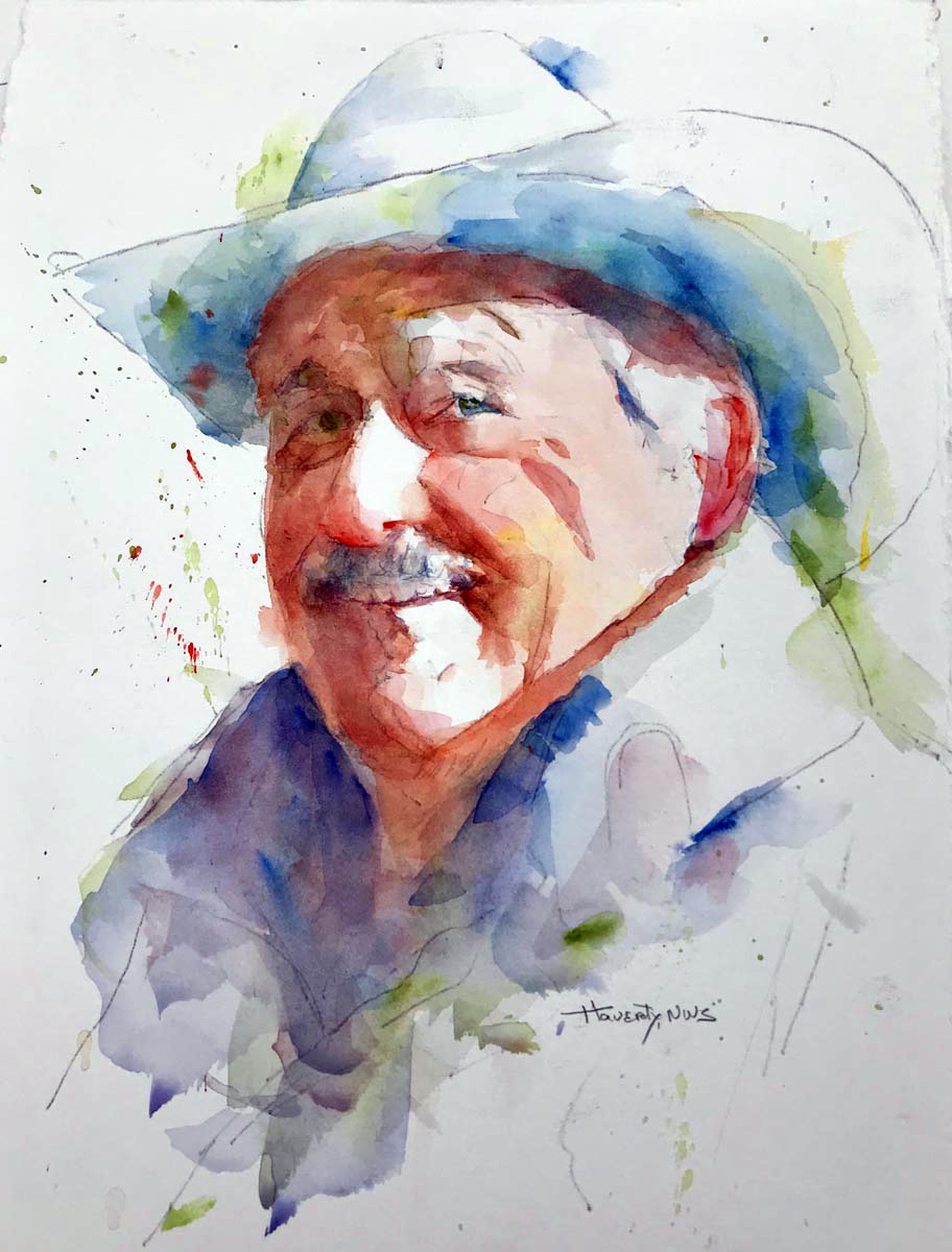
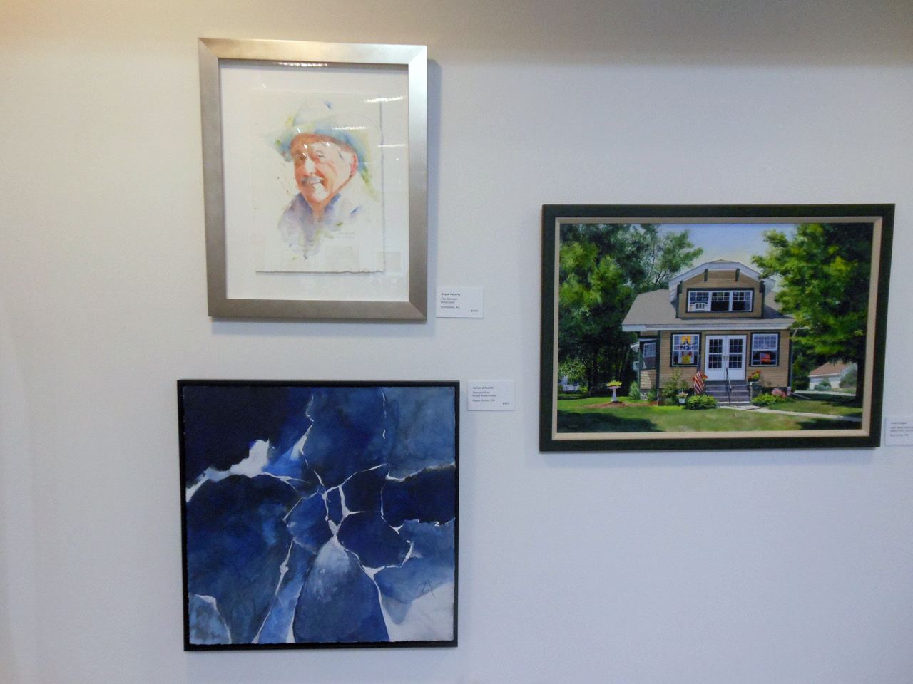
(photo right) Grace Haverty – The Rancher
I’m not a huge fan of seeing the pencil lines in a watercolor but sometimes it works, and this is, too me, one of those times. This is also a great example of watercolor at its fluid best. It suggests spontaneity and luck but I know that this was done with a very controlled and skilled hand. It also demonstrates a control of color – especially the flesh tones and shadows.
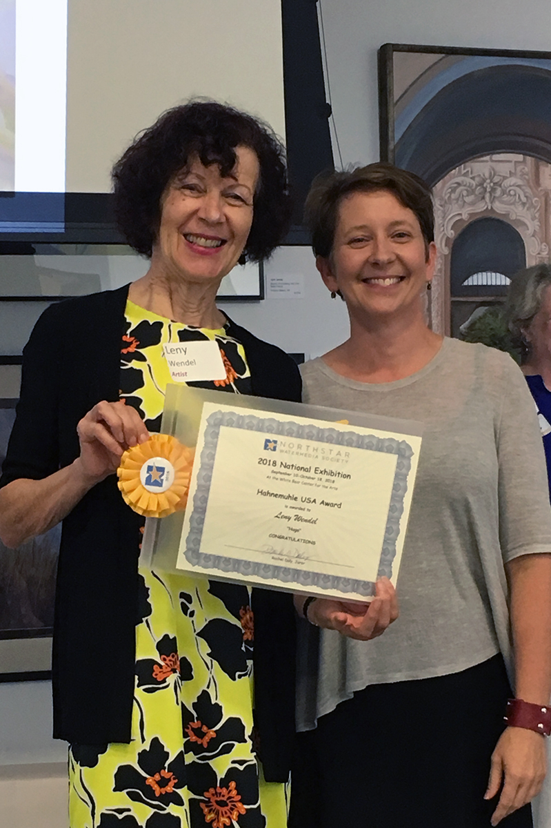
 HAHNEMUHLE USA AWARD
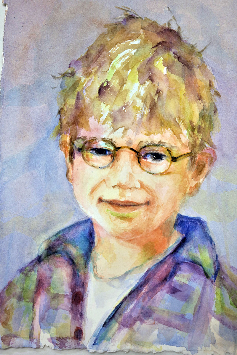
(photo left) Leny Wendel – Hugo
I loved this one as soon as I saw it online and when I saw him again in person it was like seeing an old friend – young though he is. He makes me happy. He makes me smile. He makes me want to know who he is, where he is, and who he’s going to be when he grows up. I kept coming back to Hugo and that’s why it’s a successful painting and earns this award.
 DILLMAN’S CREATIVE ART WORKSHOPS AWARD
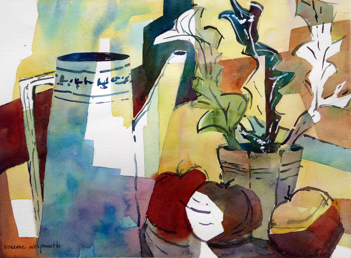
(photo right) Roxanne Weymouth – Pitcher Perfect
I love that’s it’s a still life, I love the color scheme; I love the choice not to color certain areas (in other words, the use of the paper). I love it’s stylized and simplified line.
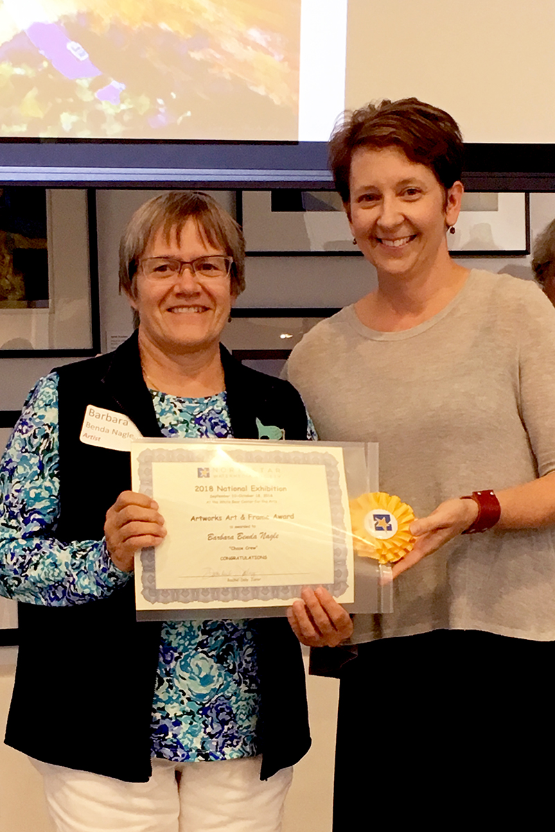
 ARWORKS ART AND FRAME AWARD
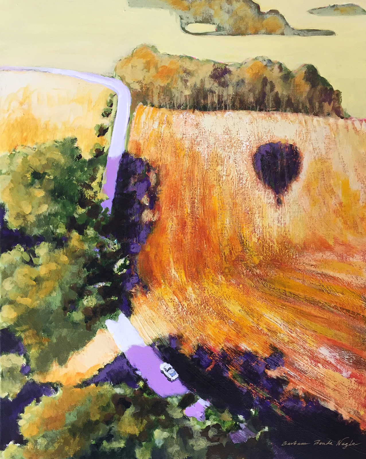
(photo left) Barbara Benda Nagle – Chase Crew
A Unique perspective…Next! Just kidding. This painting also successfully incorporates all the elements of design: Color, line, shape, value, texture. Bam!
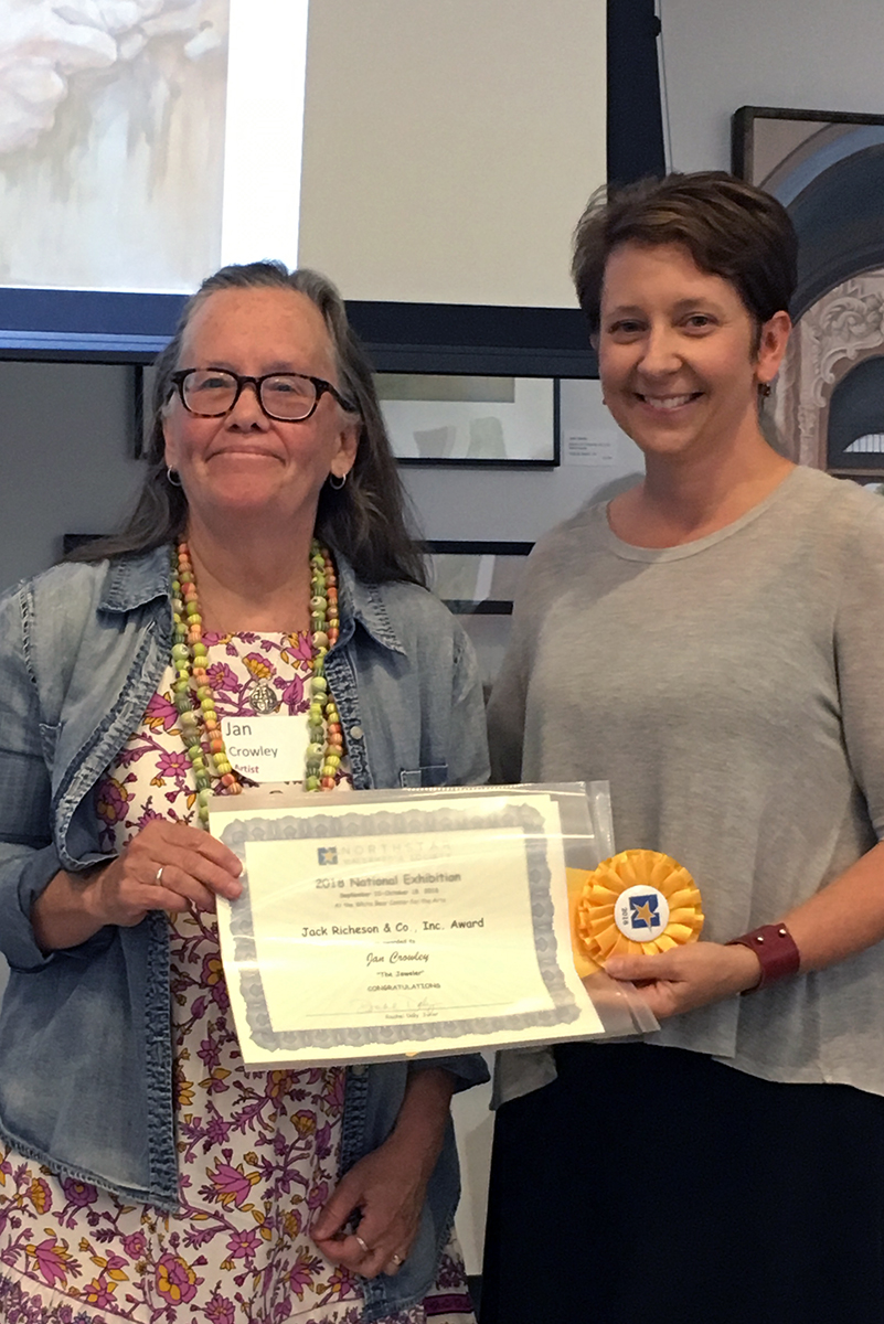
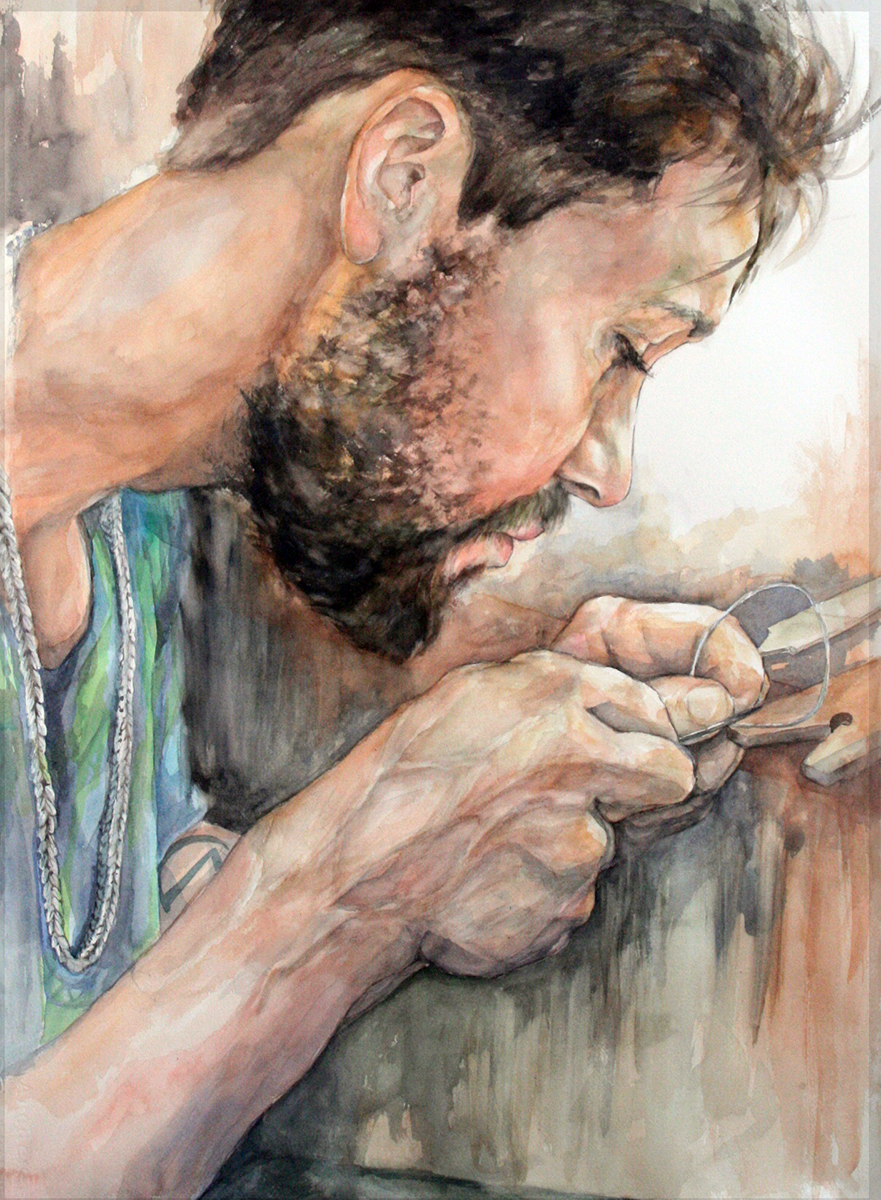 JACK RICHESON & CO I NC. AWARD
(photo right) Jan Crowley – The Jeweler
I’m going to admit something: This one troubled me. But I also LOVE it. The perspective (so up close and right in on what he’s focusing on), the exaggerated hands, the veins in his hands!, the detail of his beard, his gaze, the necklace. Again, the decision to leave some of the paper white. The story of the maker. All reasons to earn this award.
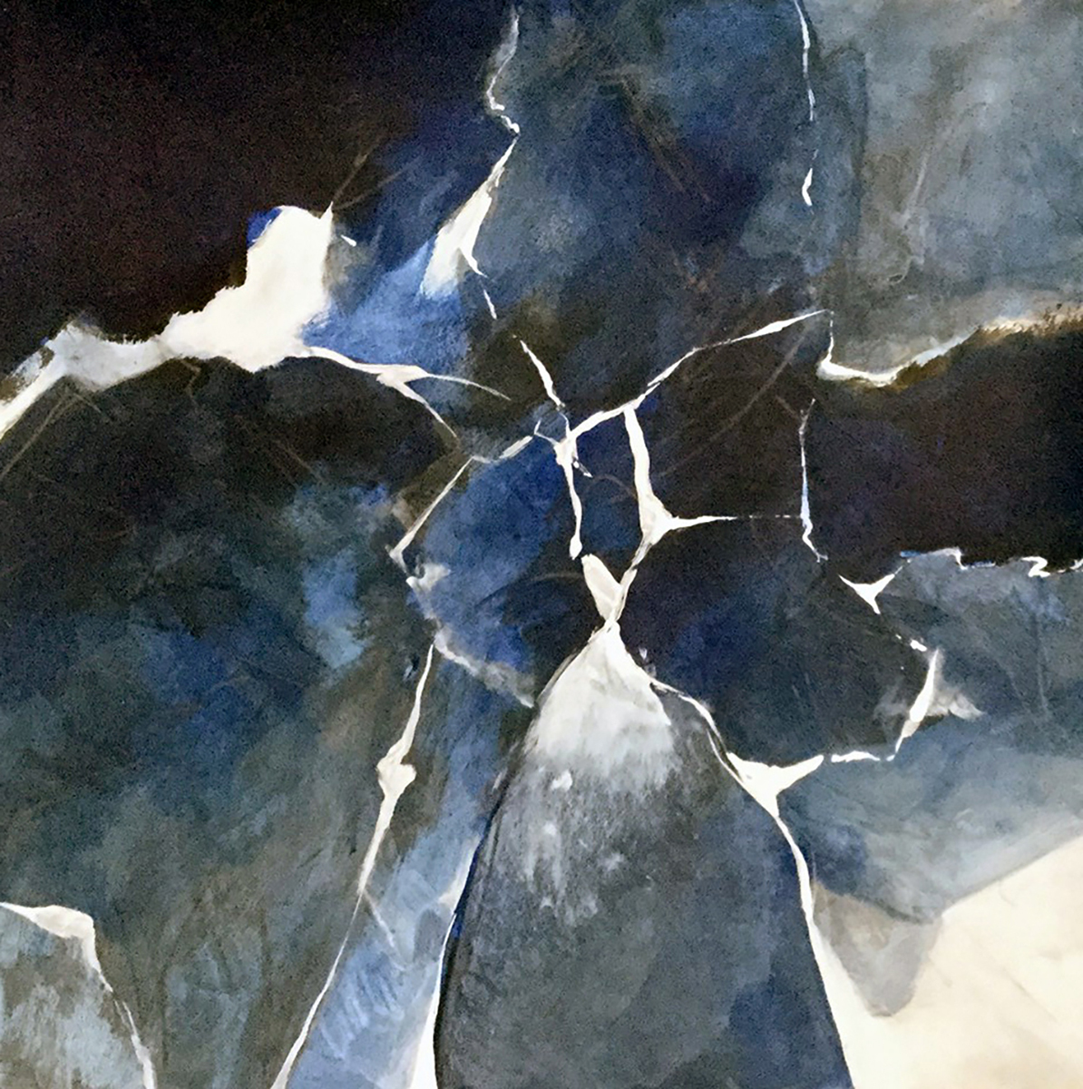 WINSOR & NEWTON AWARD
(photo left) Calvin deRuyter – Formare Due
Okay, I have to admit something else: I had to look up what the title means. It’s Italian for “Form Two”. I don’t have any idea what that means in relation to this painting and honestly, I don’t want to know. To me this painting is the crackling sound of thunder. Or what static looks like under a microscope. It is a shifting, mysterious image of ice forming in the darkness of a December midnight. That’s what Formare Due means, and well, that’s just that.
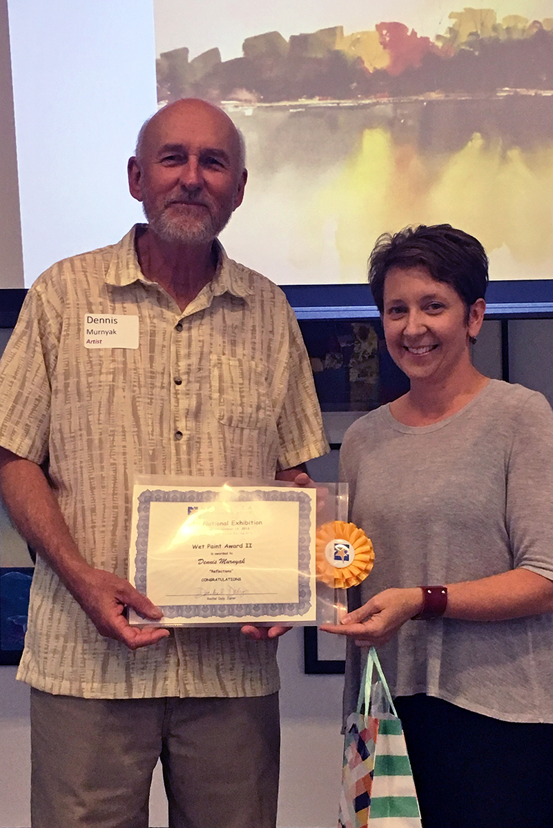
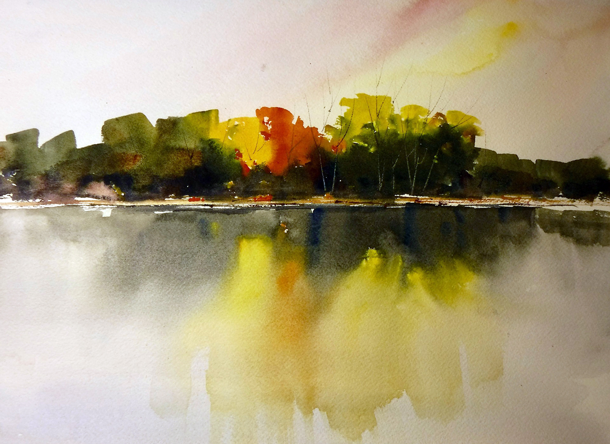 WET PAINT AWARD II
(photo right) Dennis Murnyak – Reflections
Ah! Another great example of what watermedia (and a talented artist) has the ability to do: which is to suggest a subject without over stating it. This small watercolor so successfully captures that moment of autumn’s first fiery colors and their reflection on both the water and the sky with controlled, minimal strokes. I’m truly impressed!
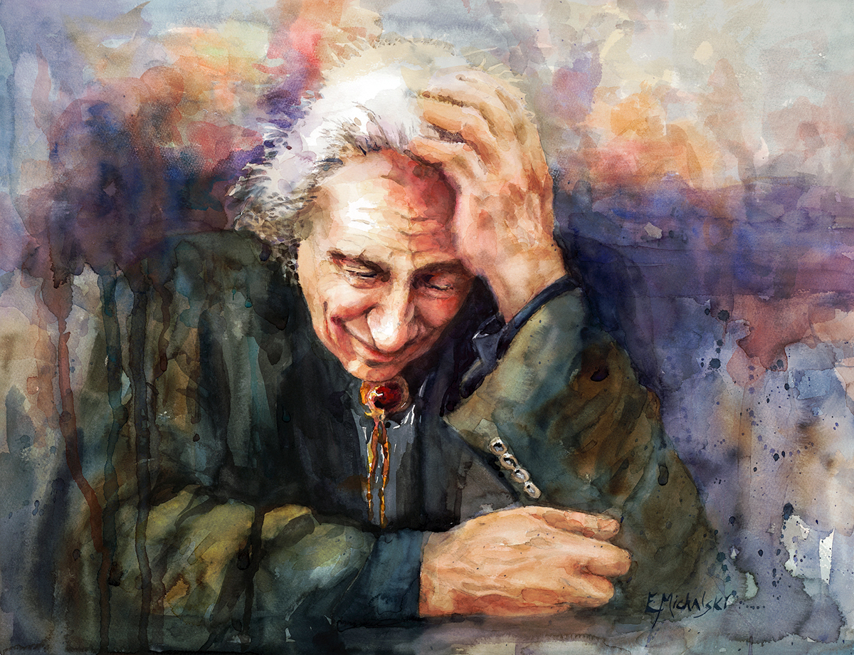 WET PAINT AWARD I
(photo left) Edie Michalski – John Steffl
John Steffl was a beloved artist and instructor at UMD and was associated with the Duluth Art Institute and the Tweed Museum. I didn’t know John. But I feel as though this painting gives me a glimpse at the man that he was. The emotion, strength and yet, sadness that this painting embodies along with the technical excellence and execution of the media really delivers. On a purely technical aspect, the rendition of his nose. Just the nose itself is spectacularly 3-dimensional. Combine that with the dripping darkness and the blurred background. Wow. John died this past June, and this is a beautiful and moving tribute.
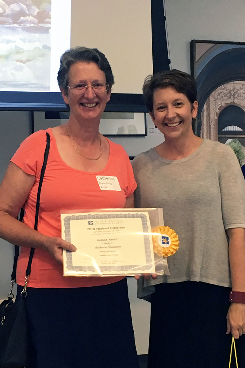
 HOLBEIN AWARD
(photo right) Catherine Hearding – Riding the Rapids
This painting is successful because Catherine was able to recreate a moment in time. I assume that this was painted from a photograph but I feel as though I’m experiencing the action more than I would if I were looking at the photograph. The foreground is perfect: The challenging recreation of the water breaking; the deftly rendered spray. But also take a look at the background! Look at the depth she was able to recreate in the trees and then the rocks. It’s really striking when you consider all that is happening in this half sheet of watercolor paper.
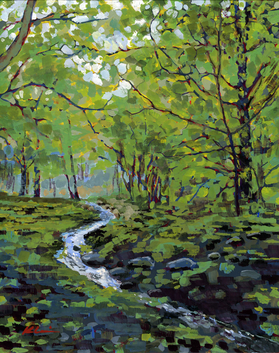 ARTISTS’ CHOICE AWARD II
(photo left) Mary Nagel Klein – Woodland Brook
Woodland Brook was created using Casein paint which is derived from milk protein. It is most likely one of the oldest painting materials ever used. It is water soluble but like acrylic it becomes quite water resistant when dry. It is very fast-drying and brittle so it’s almost always used on board or non-porous surfaces and it can resemble oil paints when varnished. I’m sharing this not because it was a factor in receiving this award but I admit I find the choice of medium really interesting. It’s receiving this award because it is such a striking and successful compact piece. It is a beautiful, calming, and tranquil use of color combinations which only enhances the subject matter. To me it perfectly captures the essence of the lushness of late spring under the canopy of trees alongside a rushing brook.
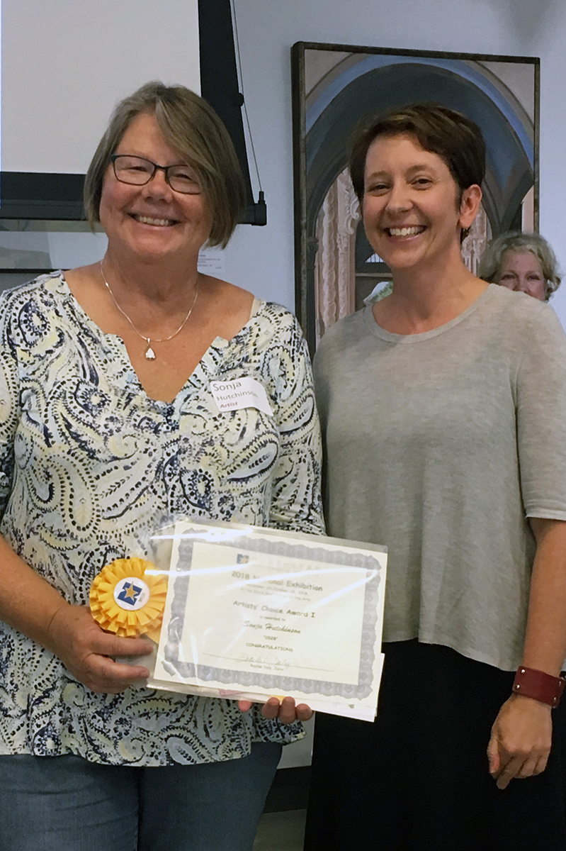
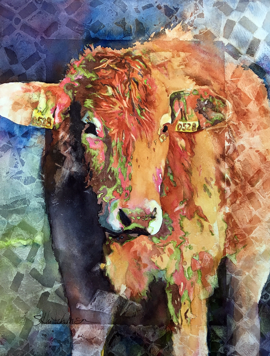 ARTISTS’ CHOICE AWARD I
(photo right) Sonja Hutchinson – 0528
I love the challenge that is taken in this painting: Framing the cow with a transparent pattern adds, obviously, a whole new layer visually and in terms of complexity. I also really enjoy the daring color combinations seen in the fur; all while so expertly drafting the subject. It’s hard not to keep coming back to this one and it’s why I enjoy it so much!
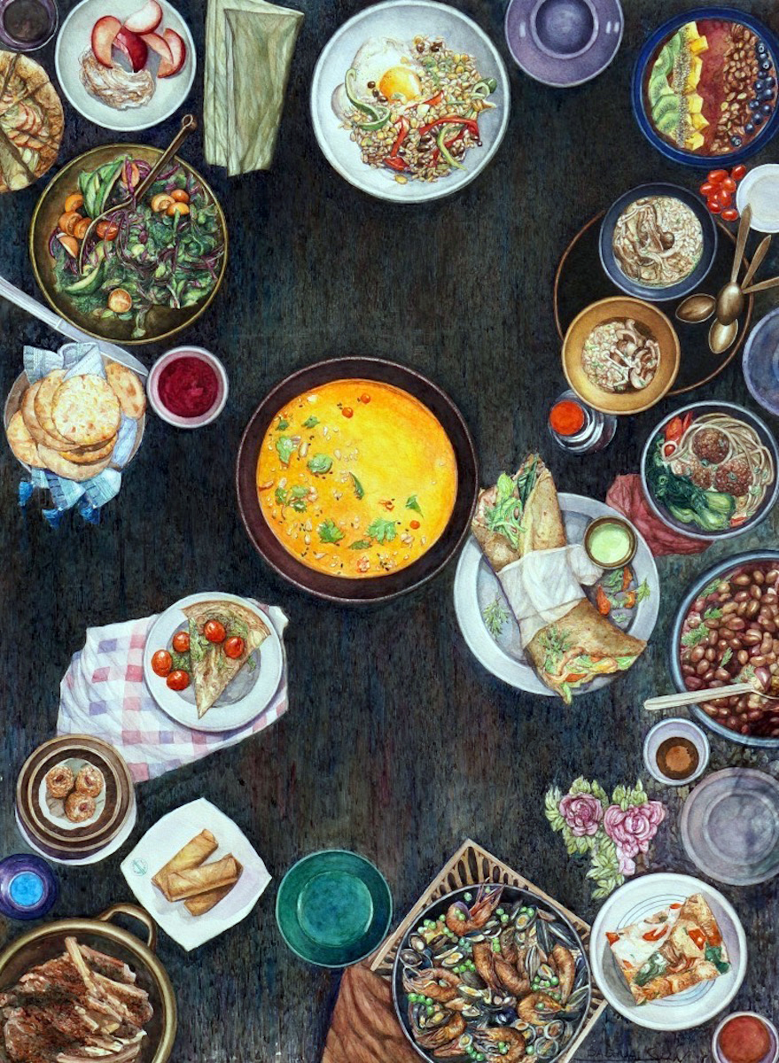 SCHMINCKE AWARD
(photo left) Dashuai Sun – Party
I really wish I had been invited to this party. Clearly the technical skill is astounding. The detail and control of the medium is dead-on. I was at first concerned by the composition. The large bowl of bright yellow, almost smack dab in the middle of the painting concerned me. It is a bold move and if it had been right in the middle it would not have been as successful. But the slight asymmetry combined with the repetition of circular shapes really works. The bright yellow forces your eye back into the painting while the detail work around the edges makes you want to take it all in and travel around. I now feel that the composition was very carefully constructed and that this aides in making it an exceptional painting. Plus, I was super hungry when I judged the awards so…
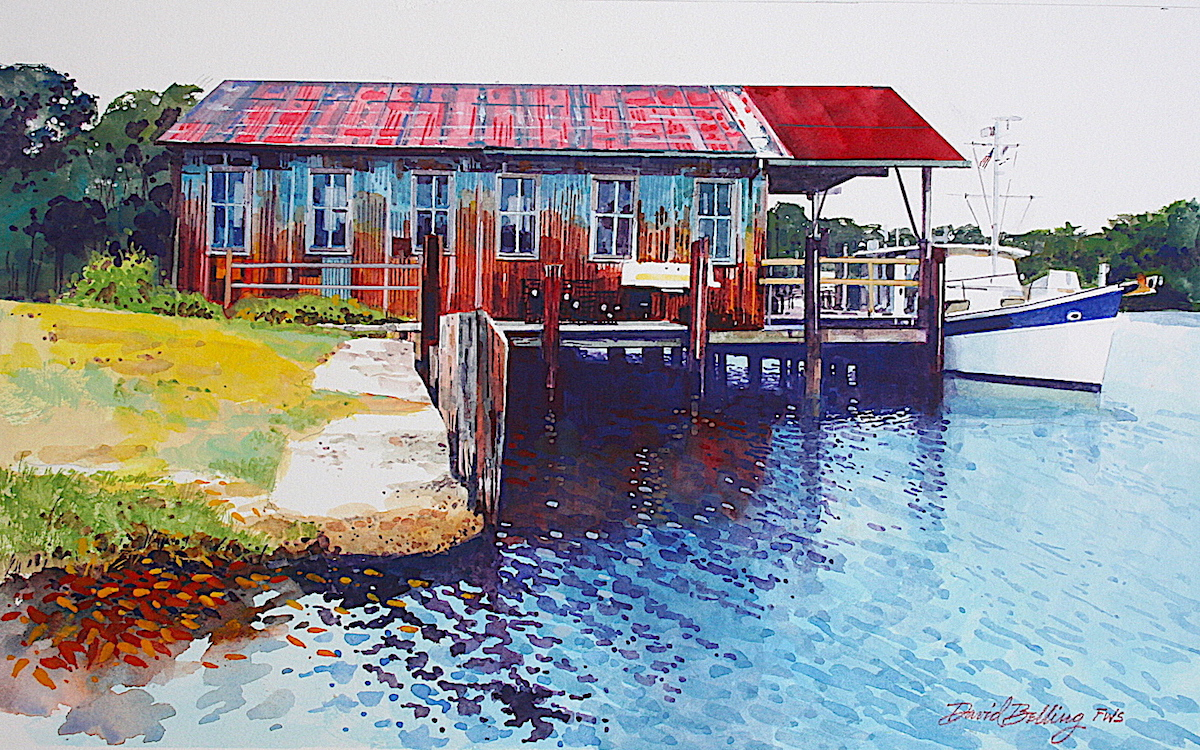 BLICK ART MATERIALS
(photo right) David Belling – Workshop
What a beautiful painting; expertly rendered. Bold color choices that also seem perfectly placed. I especially love what’s happening in the water and the perfectly shaped yacht which is clearly a sidekick to the massive amount of character embodied by the decaying structure.
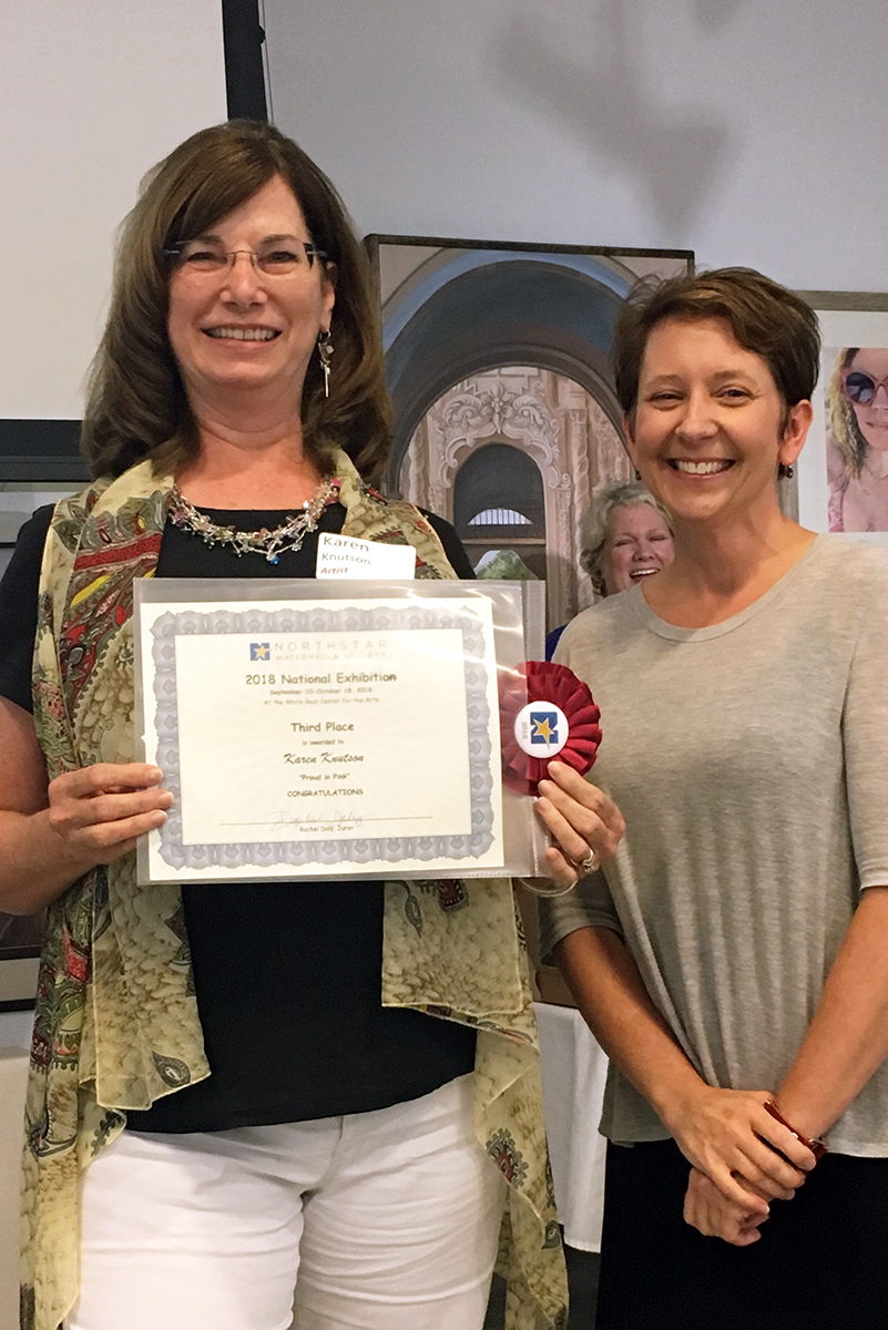
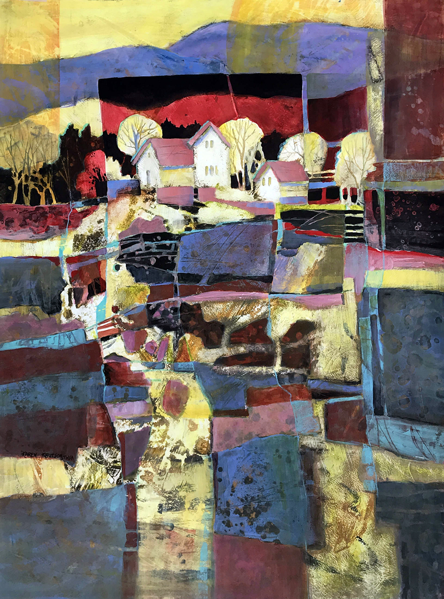 THIRD PLACE
(photo left) Karen Knutson – Proud in Pink
This painting reminds me of a Gees Bend quilt – which I love! I also love the humble cluster of houses and trees atop the patch-worked hill. I feel that the texture conveyed in this piece is the star of its show as much as and maybe more than the daring color choices and the quirky pattern. It is a complex painting and that’s why I’m giving it a 3rd place award.
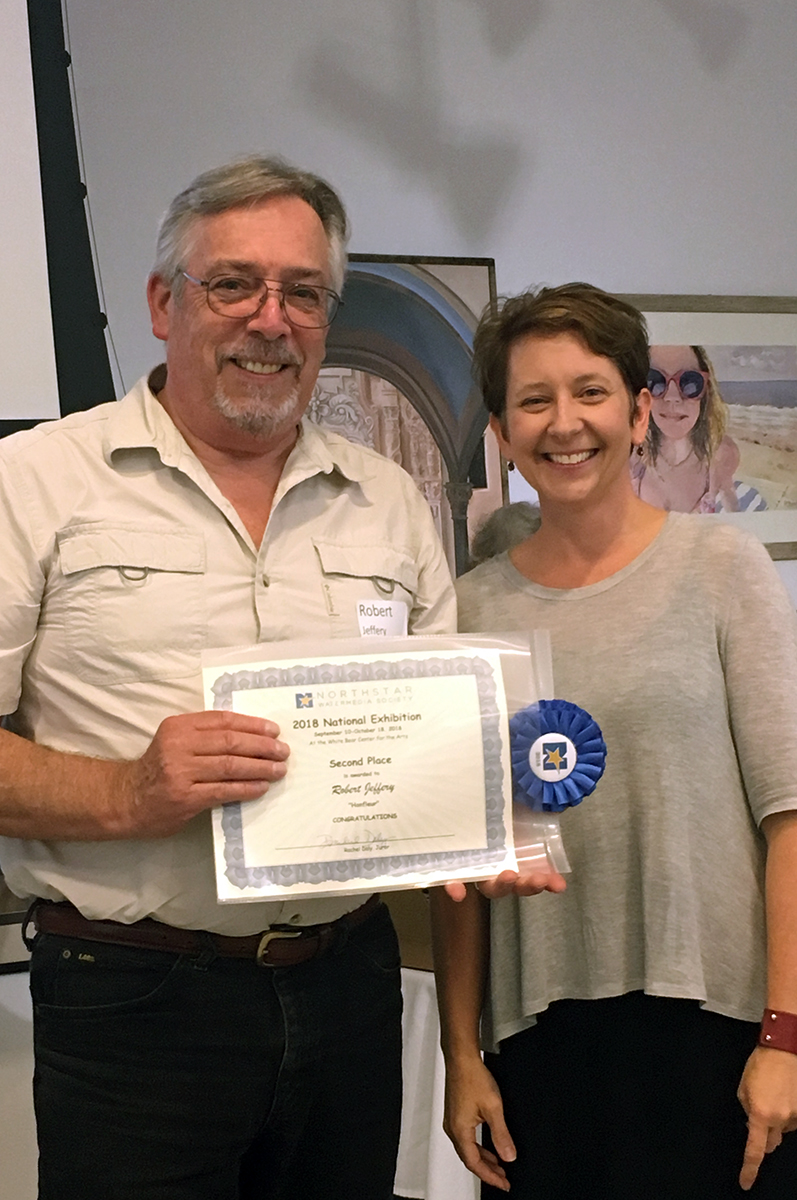
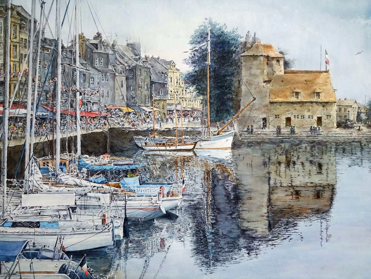 SECOND PLACE
(photo right) Robert Jeffery – Honfleur
Sometimes you just gotta say “wow”! I have not been to Normandy (or France for that matter) but my guess is that Robert more than adequately captured the feel of this busy port town with its cafes right up to the water’s edge, docked boats, and quintessential architecture. Like the “Party” painting, Robert chose to almost but not quite divide his complex composition in half using the far boat’s mast and its reflection. Doing so provides a much needed resting place for our eyes as the right half is a much calmer scene than the left. This adds to the dynamic vitality of the painting. Plus it’s just perfectly rendered.
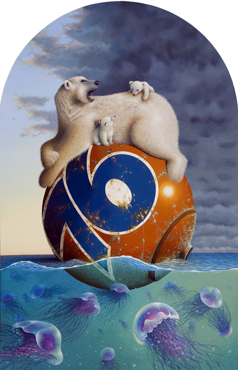
BEST OF SHOW
(photo left) Christopher Palbicki – Whatever Floats
Earlier I confessed that I’m a sucker for art that shares a story and that I will often times favor the story over technical execution. This acrylic painting does both: The drawing of the subject matter is perfect; the application of the medium is expertly applied; the proper use of color, line, shape, value, and texture are all here. I enjoy the unique perspective (seeing above and below the water at the same time). I enjoy the shape of the board which, to me, conjures a church’s stain glass window (a metaphor of sorts perhaps). But it’s the dichotomy of incongruent imagery that create a compelling story or statement that I find most clever and intriguing. The hypnotically beautiful but deadly jelly fish sharing the same space and potentially even preying on a family of polar bears as they drift along precariously perched not on an ice berg but on the iconic symbol of man’s dependence on oil and gas. In the background the sun is either setting or rising, the storm is either brewing or dissipating. I might be reaching here but it seems to me this story is about climate change and our contribution to it. It is a visual that is achieved without over complication and is still strikingly effective. Plus, it will stick with me long after this exhibition. Which, in my humble opinion, is the truest sign of a highly successful painting.
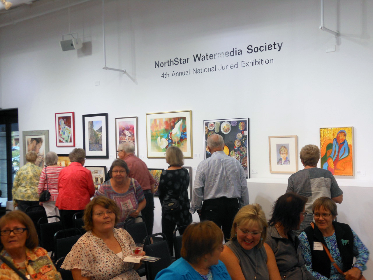
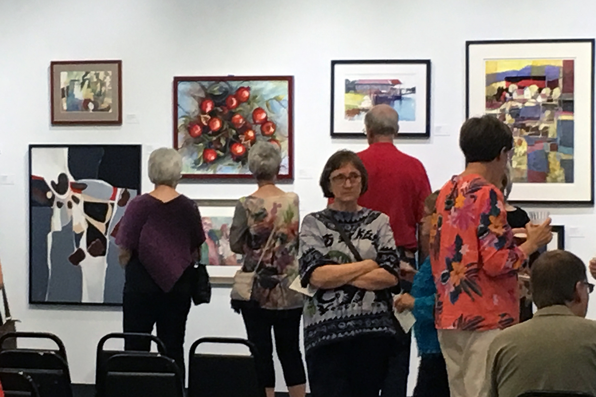
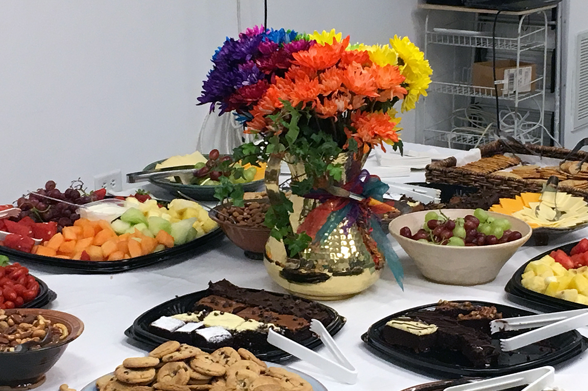
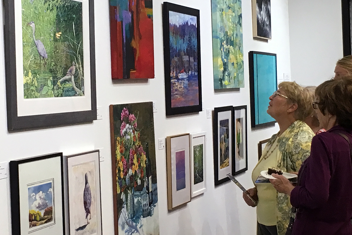
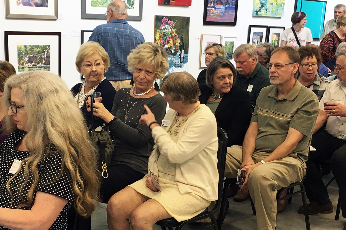
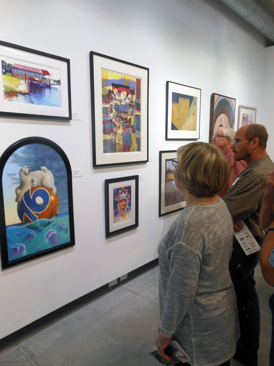
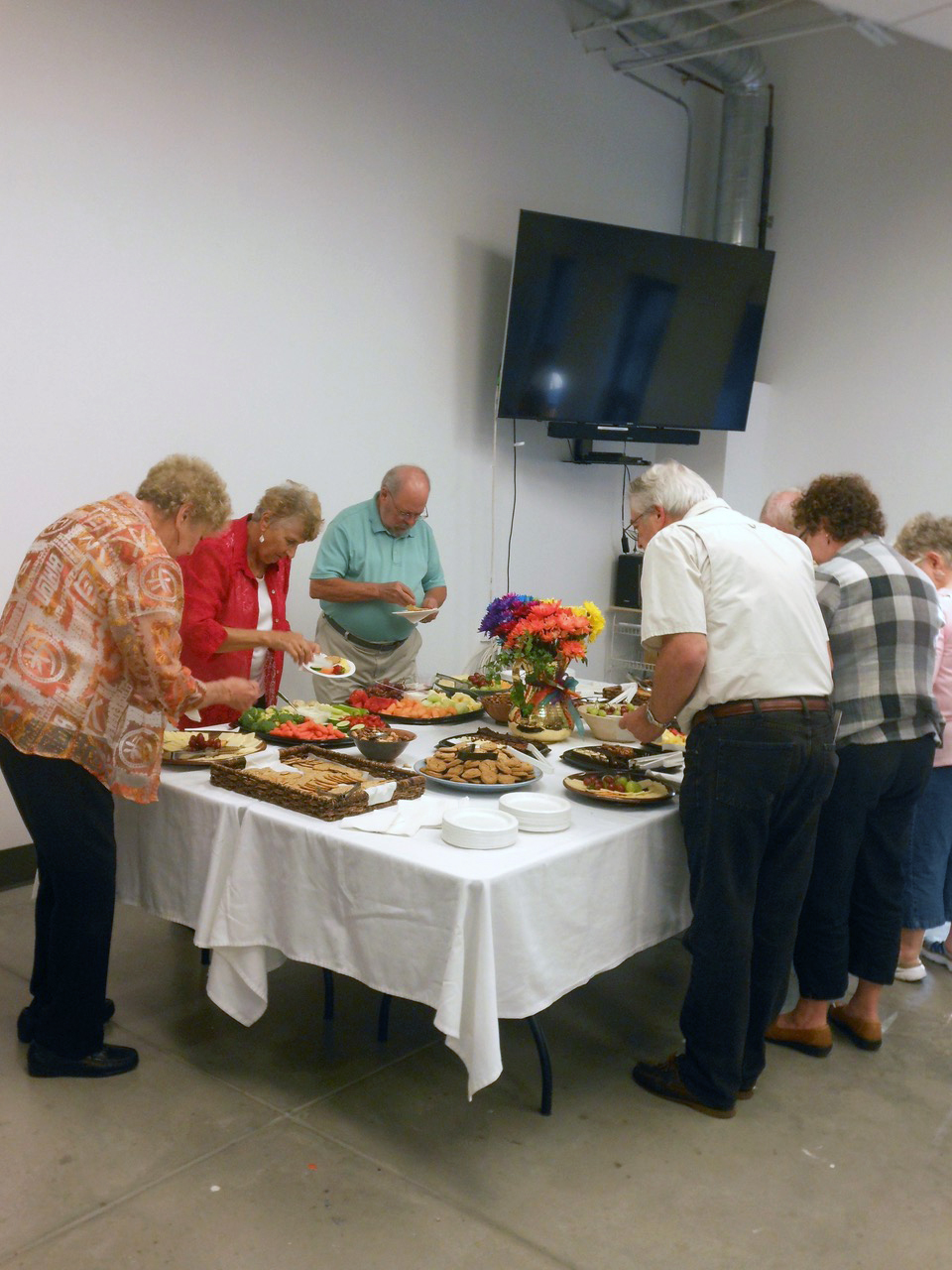
 AWARD SHOW CANDID SHOTS


THANK YOU TO ALL OF OUR SPONSORS. THE AWARDS GIVEN WERE MADE POSSIBLE BY THEIR GENEROSITY!:
![]()
![]()
![]()
![]()
![]()
![]()
![]()
![]()
![]()
![]()
![]()