2017 NorthStar Members’ Exhibition Awards: “INSPIRATIONS”
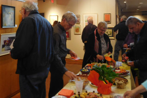
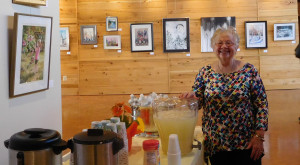
NorthStar’s 2017 Exhibition at White Bear Unitarian Universalist Church in Mahtomedi. Thanks to LouAnn Hoppe for chairing the show.
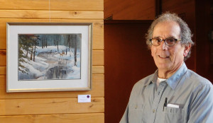 Juror Kenneth Wenzel (photo right) is a representational painter. He paints figurative, landscape, and still life works in oils on canvas and on panel. Wenzel received his BFA Degree in 1983 from The School of Visual Arts in New York City. He relocated to San Francisco and taught art to emotionally disturbed boys. Wenzel completed is MFA at the San Francisco Art Institute in 1989 and moved to Minneapolis. He presently teaches in the Art Department at Century College, St. Paul college, and lectures and teaches drawing at the Minneapolis Institute of Arts. His work has been exhibited and collected regionally and nationally.
Wenzel began his remarks by encouraging NorthStar members to “Keep working. Keep at it!” In explaining his criteria for choosing award-winning paintings, he emphasized,“Feeling is first and foremost. Whether the painting is realistic or abstract, feeling is the key.” After feeling comes form which expresses content. Wenzel looks for good design and keeps the seven design principles in mind.
His comments on each painting follow:
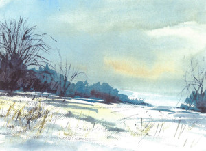 BEST IN SHOW Art Weeks – “Winter Dusk” (photo left) There is a strong sense of melancholy and sadness which reminds me of Andrew Wyeth. Nice use of space and subtle colors. Engaging!
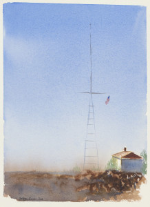
Elizabeth Oppenheimer – “September Morning” (image right) There is a strong sense of space and place. I admire the simplicity. Also, melancholy.
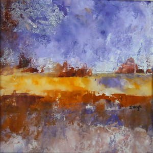
Susan Fryer Voigt – “Sun On The Fields” (image left) I like the use of thick and thin paint. Reminds me of Cezanne. Each area of color has its own identity. Quite engaging.
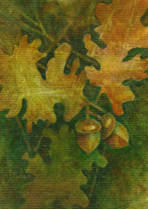
Jeannie Ferdinande – “Golden Oak Leaves’” (image right) This one demands attention. Though it is small, it feels bigger than it is. Nice use of limited palette.
Lynn Middleton-Koller – “Nid d’Abeilles” (image left) There is a spiritual feel to this painting. I like the use of collage and the way it is framed.
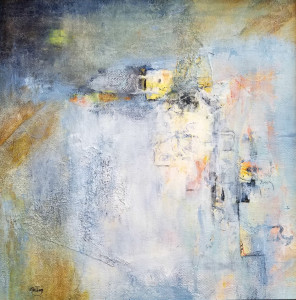 Kaye Freiberg – “The Way In” (image right) I like the emphasis on the yellow square. The paint leads you there. There is directional force and movement.
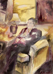
Ann Sisel – “The Knitter” (image left) A successful use of complementary colors which is very difficult to do. (Gaugin criticized Von Gogh for this which led to the cutting off of his ear!) Nice spacial relationship. Look at it from an oblique angle for a different view.
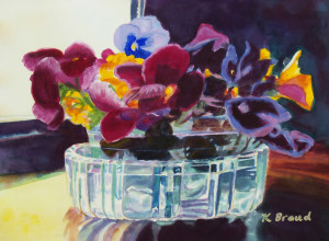
 Kathleen Braud – “Pansies in a Crystal Vase” (image left) This painting shows successful use of values – darks and lights. A nice presence of the subject.
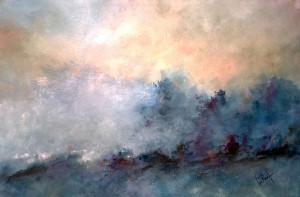
Calvin deRuyter – “Morning Ground Fog” (image right) Good use of analogous palette. Beautiful colors, as well as subtle notes, create harmony. The whole piece sings.
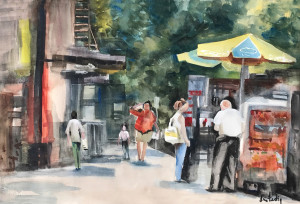 Lisa Fertig – “Street Food” (image left) This has an Edward “Hopperesque” feel. A wonderful use of space and colors with subtle reds against greens and greys.
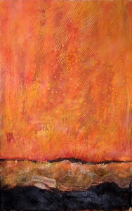
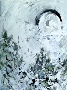
Claudia Hanson – “Silvery Moon I” (image right) There is a strong use of materials with very little color but strong strokes and a sense of direction.
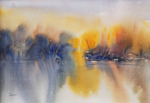
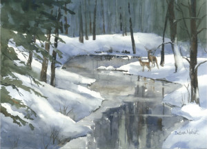 Dennis Murnyak – “Sunburst” (image left) Wonderful use of atmosphere. Nicely laid out which speaks of the materials themselves. Nice color contrast with yellows and blues.
Barbara Neihart – “Dusk” (image right) Nice use of atmospheric perspective and space which give depth to the painting.
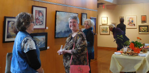
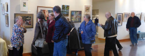
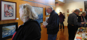
And, here are some candids from the opening!

