2012 Fall Watermedia Show: “Reflections”
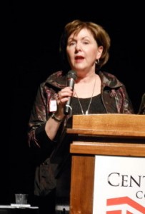
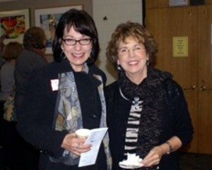
By Connie Keithahn and Barb Parisien NorthStar Watermedia Society’s Fall Show, “Reflections,” held its reception at Century College November 15, 2012. In her opening remarks, Juror Catherine Hearding (photo right) commented, “A judge should be able to explain what sets a painting apart. Then we all learn what makes a good painting.” She began by emphasizing that she relied on the elements of design as criteria for judging, but that she first looked at the show for paintings that she especially enjoyed and was drawn to. After stickering these 30 paintings, she assigned a numerical value of 1-5 in seven design categories: value, color, shape, line, focal point, movement, unity. Catherine mentioned that “color often gets the glory, but value does the work!” All of the winning paintings scored high in value. She also looked for the emotional element or story behind the painting. A final test was the feeling: I really wished I had painted that!
Judge’s Comments:
Honorable Mention
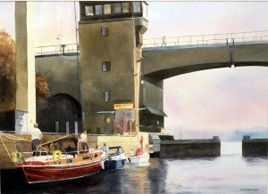 Dick Green “Ankiring Forbjuden” (photo left): Great contrast of pure hue in front against neutral background. Good line work and well defined path through the painting in a cruciform design. There is also a storyline connected with the title which means “anchoring forbidden.”
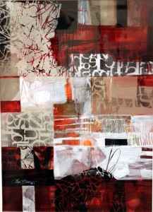 Lana Grow “Controlling the Choice, Not the Outcome” (photo right): Attracted to the color, line and pattern. Pure orange hue in the middle with deep reds. The eye jumps from one to the other with lots of variations of shapes and sizes, A very active painting with high energy.
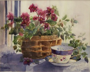 Sue Olson “Basket of Violets” (photo left): The shapes, lines, and shadows bring you into this painting. Complementary color scheme is beautiful. Stripes on the left help with movement. Nice variation of edges and repetition of color.
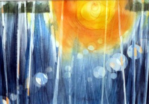
Marie Panlener ”Sun Spots” (photo right): Complementary color and pattern of repeating circular shapes draw me in. The uneven spacing of lines create movement and keeps viewer engaged. There is a peaceful mood.
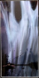 David Smith “Northern Lights” (photo left): Attractive color work, with transitions and soft edges. A limited color scheme. The interesting repetition of shapes tells a story and holds attention of the viewer. A very difficult subject.
 Lee Winberg, “Sunflower” (photo right): Great geometric and repetitive shapes. The different sizes keep the viewer busy. Transitions draw the eye through the painting. Clarity of color and nice high key approach. Sunny mood for the sunflowers.
Awards of Merit
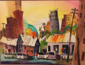 Dick Graves “Down There” (photo left): A very active painting with clarity of color and contrast supporting the value structure. Contrast in sizes of shapes of windows and building with lots of good repetition, line work and variety of edges. Bright summer mood tells a story. A very energetic painting.
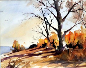
Dennis Murnyak “October on the Point” (photo right): Simplicity of shapes and color scheme express a simple statement eloquently. Clarity of color and value contrasts. I wish I had painted this!
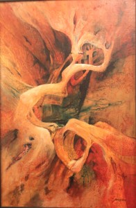 Katherine Salverda “Ancient Rhythms” (photo left): Great movement and color scheme with a beautiful flow drew me back over and over. The warm vs cool colors, created movement. The variety of shapes and edges give unity to the painting, holds attention of the viewer and invites examination.
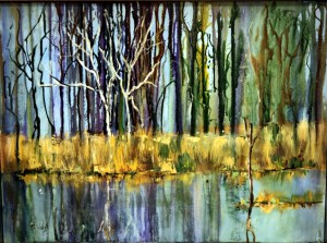
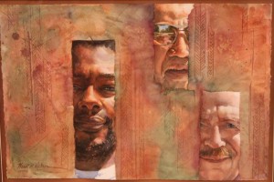
Susan Fryer Voigt“Reflections” (photo right): Great variation of color and shapes. The vertical lines create a rhythm like a musical instrument. The soft edges in the background are enhanced by the dominant soft blues.
Awards of Excellence
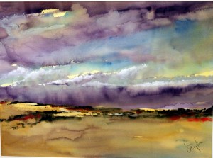 Calvin deRuyter “Cloud Waves” (photo left): The color drew me in; the values kept me there. The violet and yellow color scheme gives this painting high intensity. All the components of color are clear and fresh. Soft edges at the horizon add to variety in the spacing of the clouds. Freshness with a moody feel. I wished I had painted this one.
Heidi Nelson “Abel’s Kin” (photo right): I was attracted by the faces which are the focal point, then by the color scheme of warm against cool. The background pattern enhances the variety of spacing. There is definitely a story here as intended in the title. I wish I had painted this.
BEST of SHOW
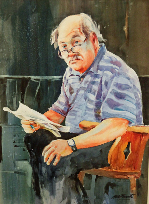 Nels Femrite “NY Times Crossword” (photo left): This painting has all of the seven elements of design. The value pattern creates movement with a variety of shapes which are linked together. The big negative space in the background has texture. There is variety and quality in the edges and lines. Definitely a story here. A fabulous painting and I wish I had painted it!
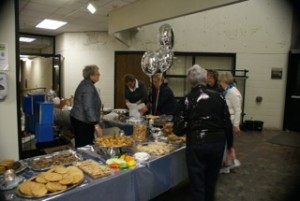
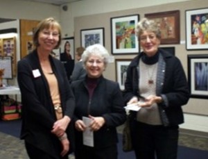
Selected photos from the opening of “Reflections”
Photos by Connie Keithahn, Barb Parisien, and Patty Healy

